Buyer Guides
How to Specify Luminous Letters: Stroke, Depth and Height
The three dimensions that decide whether a luminous letter drawing is buildable: minimum stroke, overall depth and letter height band, with the ranges each construction family can hold.
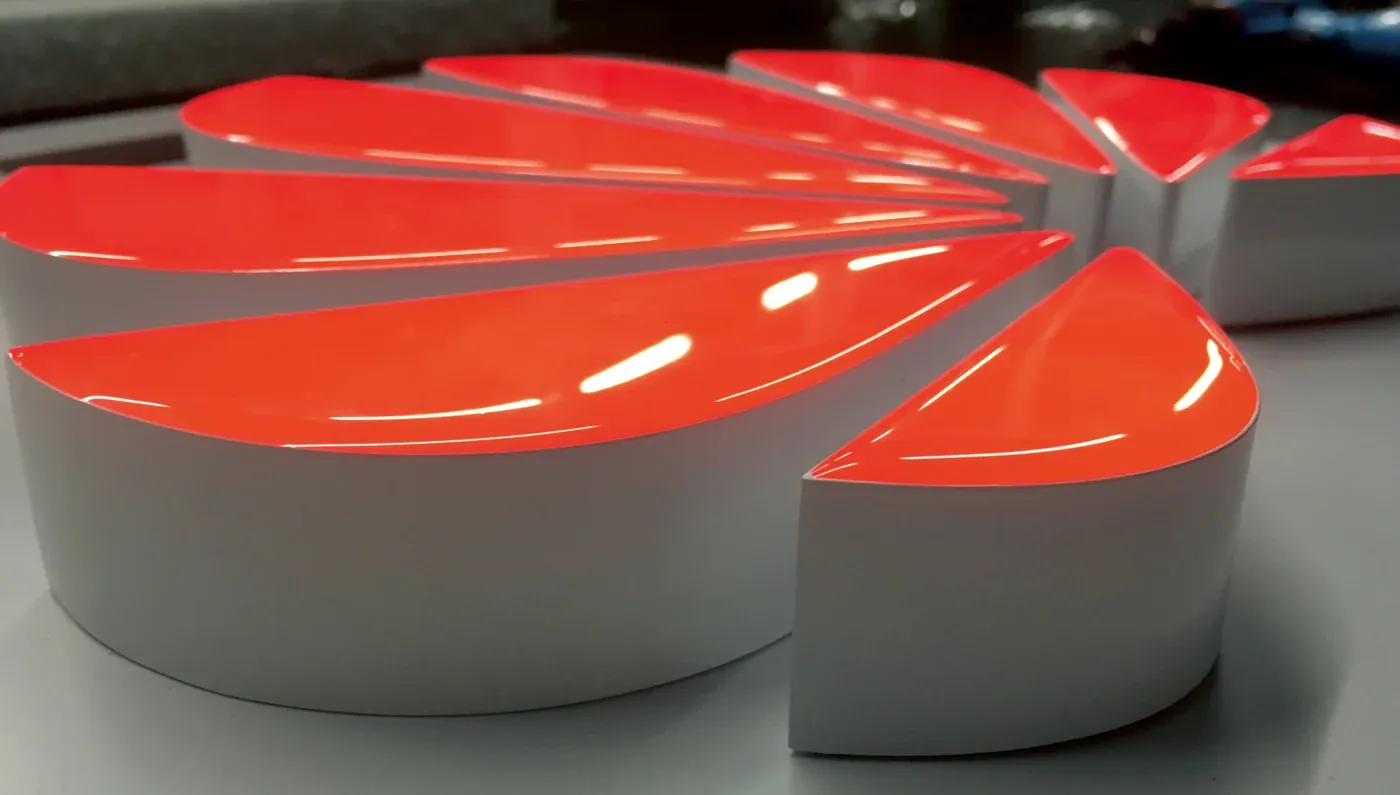
A luminous letter drawing that reaches a fabricator with a logo, a colour and nothing else comes back as a question list. Three numbers decide whether the drawing can be built at all: the minimum stroke in the logotype, the overall depth off the wall, and the letter height band. Get them wrong and the sign is not "a bit expensive" — it cannot be fabricated in the construction you asked for.
Why these three numbers decide the sign
Each one is a constraint from a different direction.
Stroke is the narrowest part of the letter that has to carry everything else: the return, the trim, the light source and the closing weld or bond. Every construction family has a floor, because below that width there is no room left to light the face evenly or to close the shell cleanly. A hairline serif in a brand mark is usually what sets this number, not the cap height.
Overall depth is the distance from the wall to the outer face. It sets how much light source fits behind or inside the letter, and it decides whether the light reads as a lit face or as a glow on the wall.
Letter height sets which family is available at all. Small letters have to be milled rather than assembled; large letters have to be shell-built with modules behind the face. A height that sits outside a family's band is not a tolerance problem, it is the wrong family.
The specification table
These are the published ranges for the constructions we build. Read the stroke column first, because that is the one that most often rules a family out.
Series | Stroke | Depth | Height |
|---|---|---|---|
PM-SW | 30mm | 30–80mm | 300–5000mm |
PM | 30mm | 30–80mm | 300–5000mm |
SZ | 12mm | 30–80mm | 30–1000mm |
ZC | 13mm | 35–60mm | not published |
CB | 6mm | 25–60mm | 50–1500mm |
LK | 12mm | 25–30mm | 120–1000mm |
WB | 8mm | 25–30mm | 30–1000mm |
MH NEON | 12mm | 30–35mm | 12–900mm |
MINI DP | 13mm | — | 200–1500mm |
DP | 45mm | 120mm | 50mm and up |
Illumination direction, which the table does not list, splits the families three ways. PM-SW, PM and SZ are front-lit. ZC, LK, WB, MH NEON, MINI DP and DP are front and side-lit. CB is side and back-lit, which is why it carries the smallest stroke floor in the range.
Two cells are deliberately empty. The ZC series table does not publish a height band, and the MINI DP table publishes no overall depth figure. Both are real gaps in the published data, not omissions here — confirm them against the actual drawing before you commit.
Choosing the band, not the product
Start from the brand mark, not from the product range.
- Measure the narrowest stroke at final size. Not at the size in the brand manual — at the size the sign will actually be. Strokes scale with the letter, so a mark that clears a 30mm floor at shopfront size can fall under a 12mm floor when the same mark is scaled down for an interior wall. Measure the scaled drawing, never the original artwork.
- Read the illumination direction off the facade. A front-lit face is the bright element the viewer sees. A side or back-lit construction hides the source and puts the light on the wall, which needs a wall surface that can take a glow rather than a bright panel.
- Check the height against the band. A 900mm letter can be built in several families. A 200mm letter cannot be built in PM-SW, whatever the stroke says, because the family starts at 300mm.
- Record the depth you actually have. Awning clearance, recess depth and landlord rules on projection all cap the depth before the construction does.
If the mark fails on stroke, the answer is usually to grow the letter, not to change the family — growing the letter scales the stroke with it, while changing down to a smaller-stroke family changes the way the sign reads at night.
Where each family stops
The table's floors are hard boundaries, and the interesting decisions happen at them.
- Below 6mm stroke, nothing in this range fits. Six millimetres is the lowest published minimum, in CB. A logotype with a hairline thinner than that needs either a larger final size or a different sign type.
- PM-SW and PM stop at 300mm height and 30mm stroke. They are the families for large facade letters, and both constraints point the same way: they are built for reading at distance.
- MINI DP and MH NEON start small. MH NEON reaches down to 12mm letters and MINI DP starts at 200mm with a 13mm stroke floor. These are the families for interior walls, reception desks and category markers, where a shopfront-scale letter would overwhelm the space.
- DP is a different animal. A 45mm stroke and 120mm depth mean marquee bulb construction, which is a deliberate retro choice rather than a fallback when other families fail.
- ZC is published without a height band. Treat it as unavailable for a drawing until the band is confirmed in writing.
Colour temperature is the other number worth locking early. The front-lit PM-SW and PM families publish 6500K, 4500K and 3000K or panel colour. SZ, ZC, CB, LK and WB publish a 3000K–14000K range. MH NEON publishes 3200K–14000K. A 3000K sign and a 6500K sign next to each other on the same frontage will not look like the same brand, so decide it at specification, not at installation.
What this table cannot tell you
The specification table covers geometry. It does not cover electrical design, driver selection, fixing to the actual substrate, local permit requirements or how long fabrication takes. Those are separate decisions, and none of them change the three numbers above — but a drawing that ignores them will still stop at site.
It also does not give you a price. Stroke, depth and height determine how much material and how much light source a letter needs, which is why a fabricator will ask for them before quoting anything, but the numbers in this table are construction limits, not costs.
Your drawing checklist
Fill this in before the drawing leaves your desk, and keep it as page one of the package.
- Final letter height, in millimetres, measured on the facade.
- Narrowest stroke in the logotype at that final height.
- Illumination direction: front-lit, or side/back-lit.
- Overall depth available, and the depth you are specifying.
- Colour temperature, in Kelvin.
- Construction family chosen, with the table row that permits it.
- The two gaps flagged: ZC height band, MINI DP depth.
A drawing with those seven lines attached is buildable in a way that a drawing with only a logo is not. The fabricator can check the geometry against their own tooling, and you can compare two constructions on the same numbers instead of comparing photographs.
The full range of constructions, with the substrate and finish options for each, is on the products page. For the reading behaviour behind the illumination choice, see front-lit vs back-lit luminous letters.